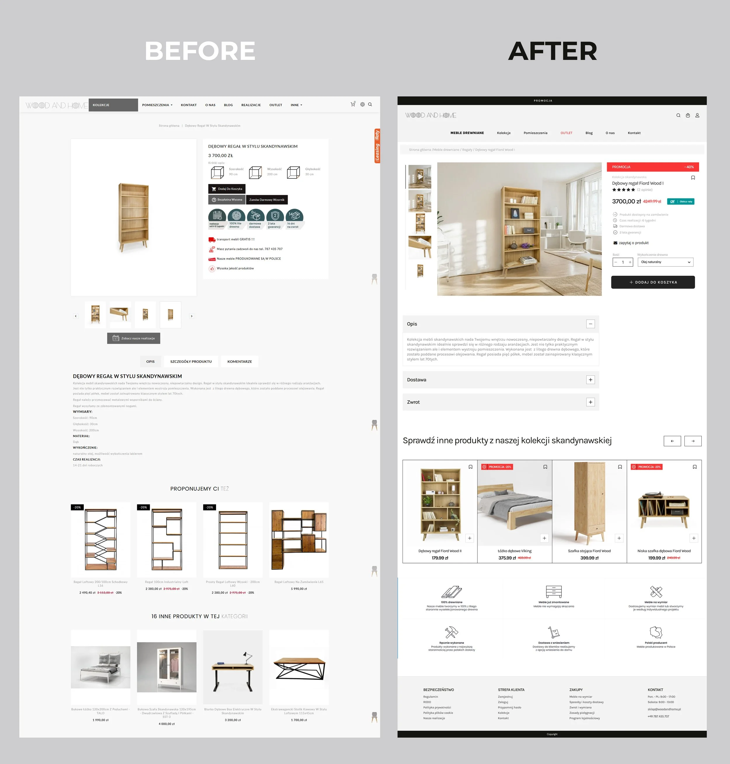
Game UX Case Study: Frostpunk 2 (2024)
For Frostpunk 2 – a complex city-building survival game set in a harsh, frozen world – during the later stages of development I shifted from concept art toward UX, identifying and addressing opportunities to improve the PC player experience within my scope. I refined interconnected systems—such as economy, population, and politics—to make them more intuitive and easier to navigate. I later took on the role of Product Owner for the console UX team, leading the adaptation for Xbox and PlayStation while preserving the game’s depth and challenge.
1) Improving Consistency of City Event Trackers
Problem
When multiple event trackers appeared simultaneously over the city, players struggled to remember which icon triggered which type of event. This was particularly critical as events varied in importance and required different levels of attention. The mismatch between tracker icon shapes and the dominant shapes of the corresponding event windows (e.g., a triangle triggering a full-screen view with a circular visual motif) increased cognitive load and slowed down decision-making.
Three types of Event Trackers above the city
Insight
This inconsistency forced players to rely on recall instead of recognition, making the interaction less intuitive—especially in high-pressure gameplay moments.
Solution
Based on this, I proposed aligning tracker icon shapes with the dominant visual language of their corresponding event windows:
inverted triangle → citizen insight (aka Ghost)
rectangular shape → small event (aka Small Lens)
circular shape → big event (aka Big Lens)
This created a more predictable and cohesive mapping between trigger and outcome.
City Event Trackers with corresponding modal windows and proposed solution
Outcome
This change improved recognition over recall, reduced cognitive load, and made it easier for players to quickly identify and prioritize events.
2) Improving Currency Discoverability in Community Panels
Problem
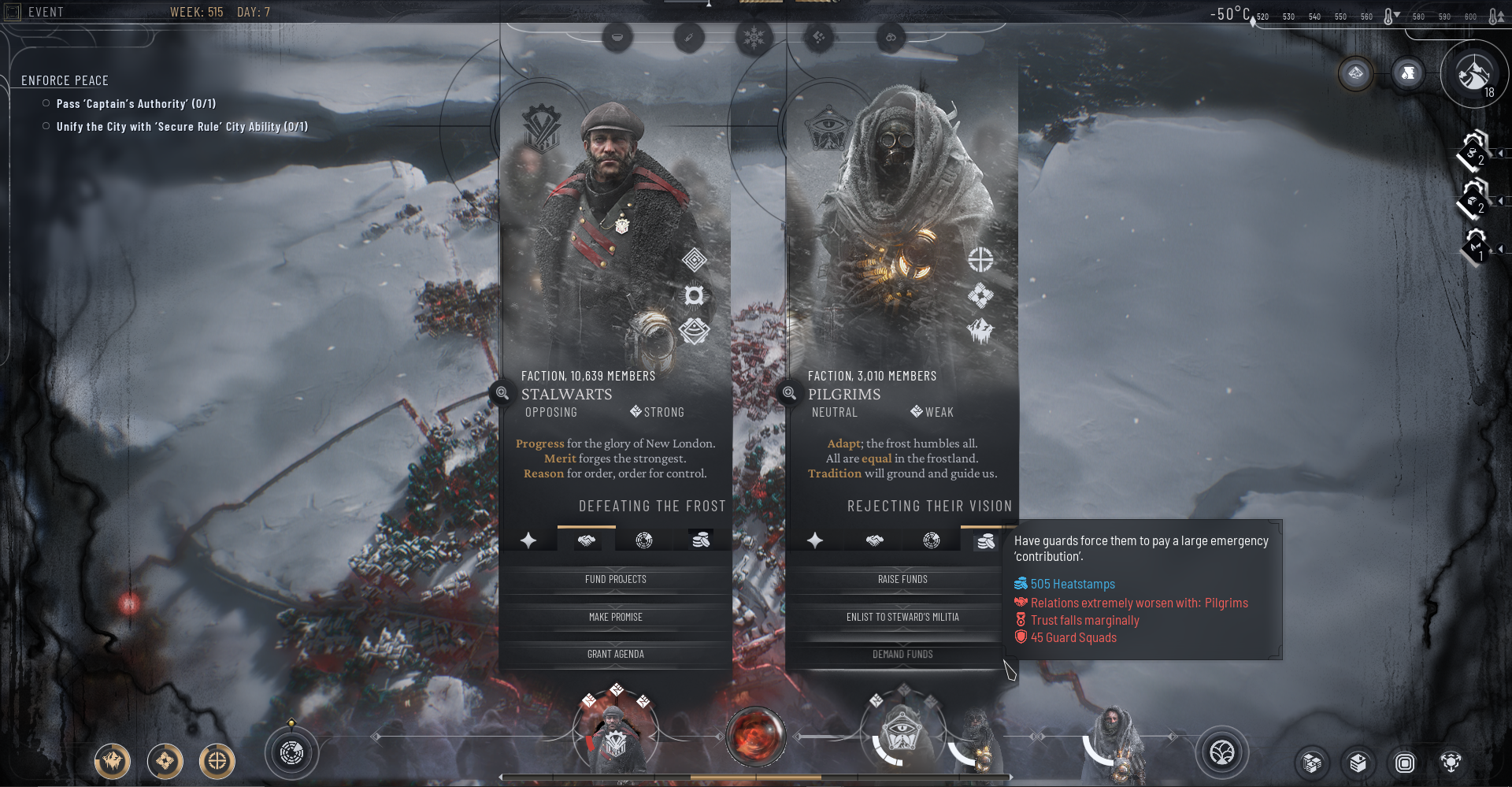
Players struggled to find how to acquire Heatstamps, a key currency required for city development. In the Community Panels, actions that generated Heatstamps were grouped under a tab marked with a Relationships icon, as they came at the cost of worsening faction relations.
At the same time, actions that improved Relationships were placed under a tab marked with a medal icon (associated with Trust), which did not clearly communicate its purpose.
This created a disconnect between player goals and UI structure:
players looking for currency did not associate it with the relationships tab
players misinterpreted the medal icon as progression or status rather than relationship improvement
both tabs required tooltip verification to understand outcomes
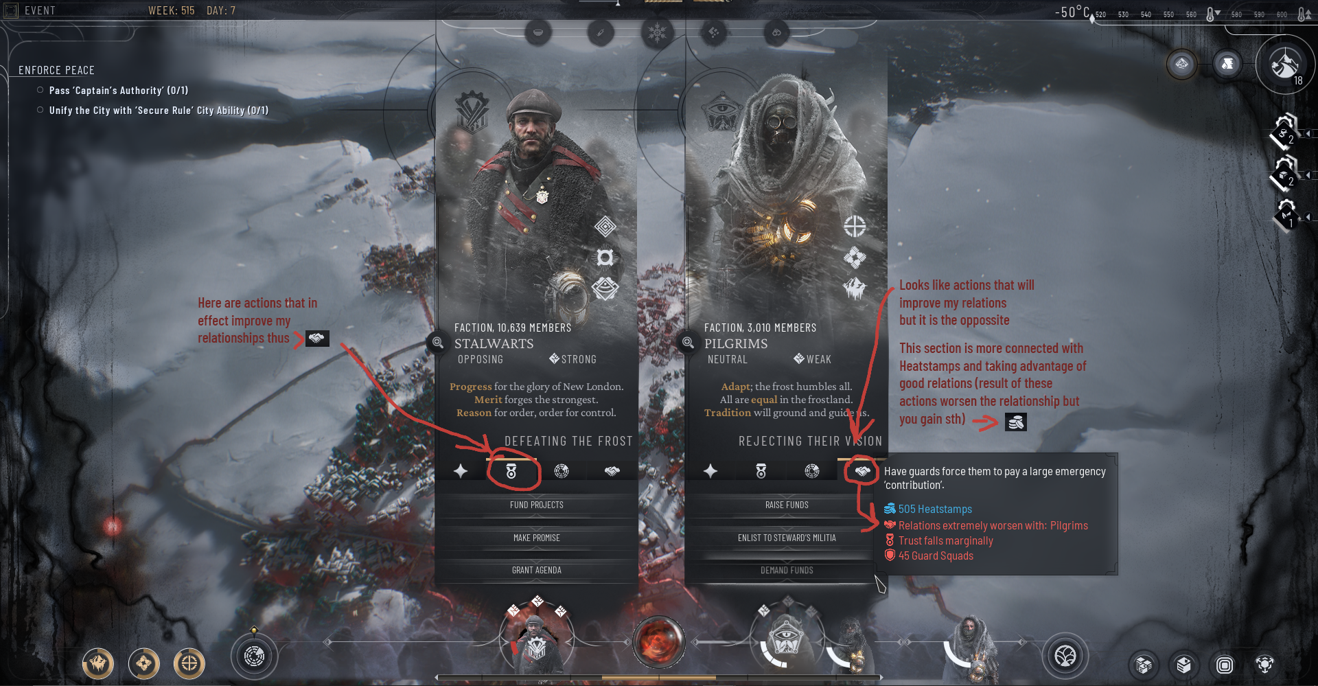
Initial Community Panel tabs with marked confusing icons
Insight
The issue stemmed from a mismatch between system logic (trade-off: resources vs. relationships) and player mental models (goal-driven navigation: “I need currency” vs. “I want to improve relations”).
Players scan interfaces based on expected outcomes, not underlying mechanics. When labels and icons reflect system rules instead of player intent, findability breaks down.
Solution
I proposed and implemented replacing the two misleading tab icons to better reflect player-facing outcomes:
proposed a Heatstamps icon for actions generating currency
replaced the medal icon with one clearly associated with Relationship improvement
This shift reoriented the navigation from system-driven categorization to goal-oriented grouping, making it easier for players to locate desired actions.
Community Panel tabs after the changes
Outcome
The updated iconography improved feature discoverability and reduced reliance on tooltips. Players were able to:
quickly identify where to gain Heatstamps
better understand the trade-off between resources and relationships
navigate Community Panels with greater confidence
Reframing the navigation around player goals rather than system logic significantly improved clarity and reduced friction in a core decision-making loop.
3) Load Game & Loading Screen Redesign
Problem
The original Load Game flow separated key save information from the decision-making moment. Save specifications (such as city stats, factions, or difficulty level) were only shown after selecting a save, on the loading screen. This made it difficult for players to compare multiple saves efficiently and increased the risk of selecting the wrong one.
At the same time, the loading screen itself displayed detailed save information, which created confusion. Players often misinterpreted it as an additional selection or confirmation step rather than a transition into gameplay.
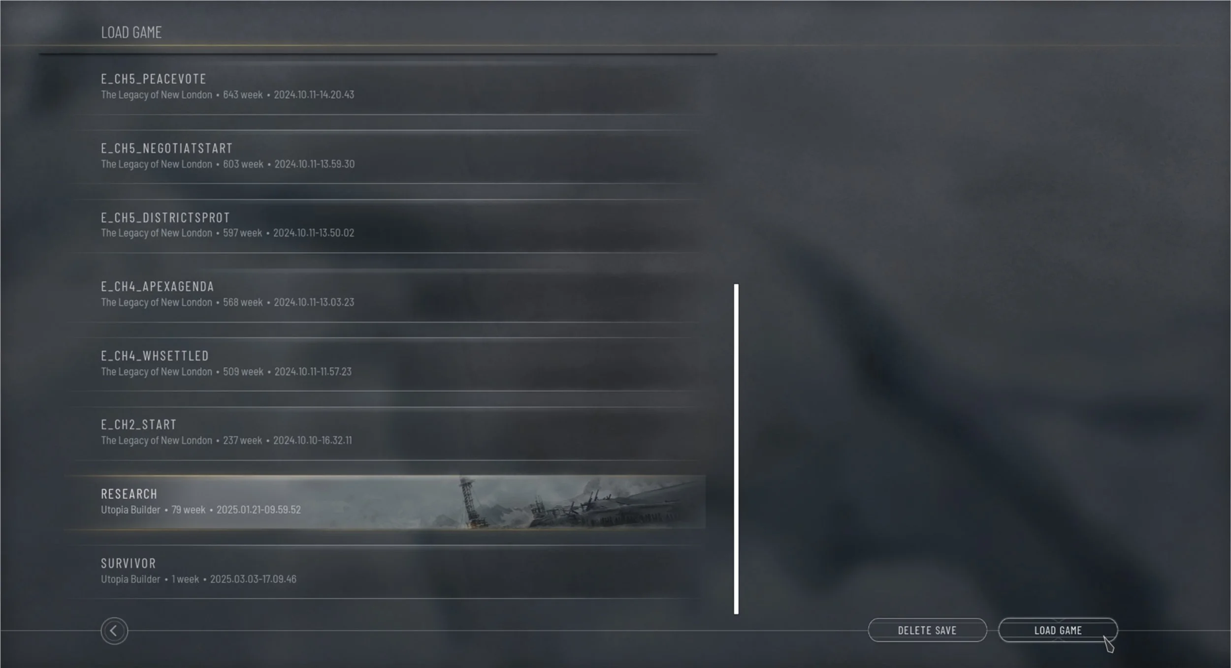
Initial Load Game Screen
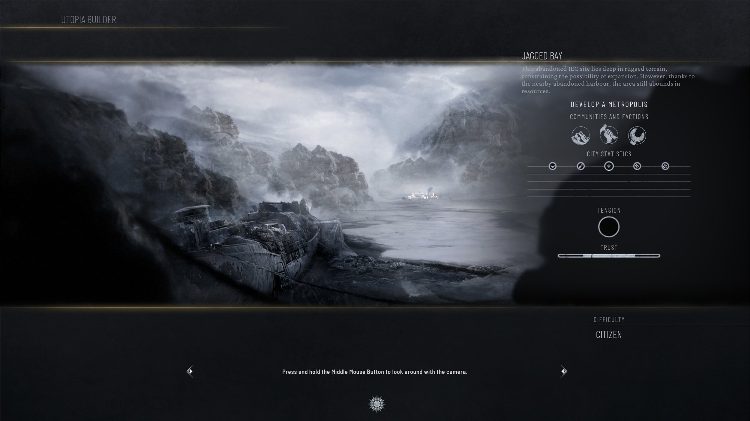
Initial Loading Screen
Insight
Two core UX issues emerged:
Players need comparative information at the point of decision, not after it.
Loading screens should support transition and immersion, not introduce cognitive load or decision-making ambiguity.
Solution
I redesigned the flow by integrating save specifications directly into the Load Game screen, surfacing key details alongside each save slot. To support faster recognition, I introduced contextual chapter and map illustrations in the background. This enabled quicker visual comparison before confirming a selection.
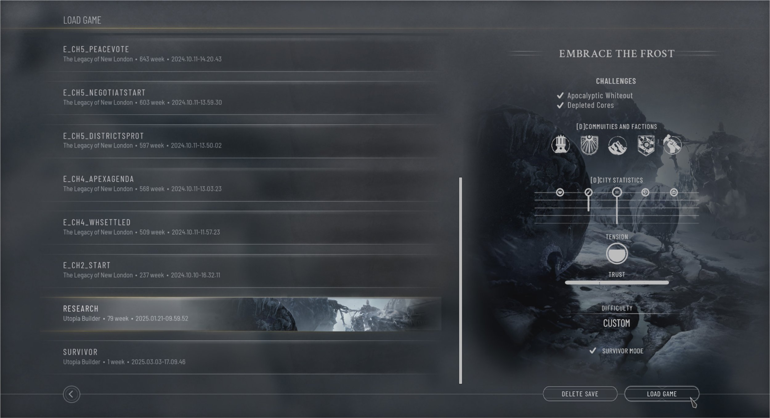
Load Game Screen - redesign proposal
The loading screen was simplified and refocused as a transitional experience. By removing redundant save details, it became more atmospheric and readable, reinforcing the feeling of entering the game rather than navigating menus.
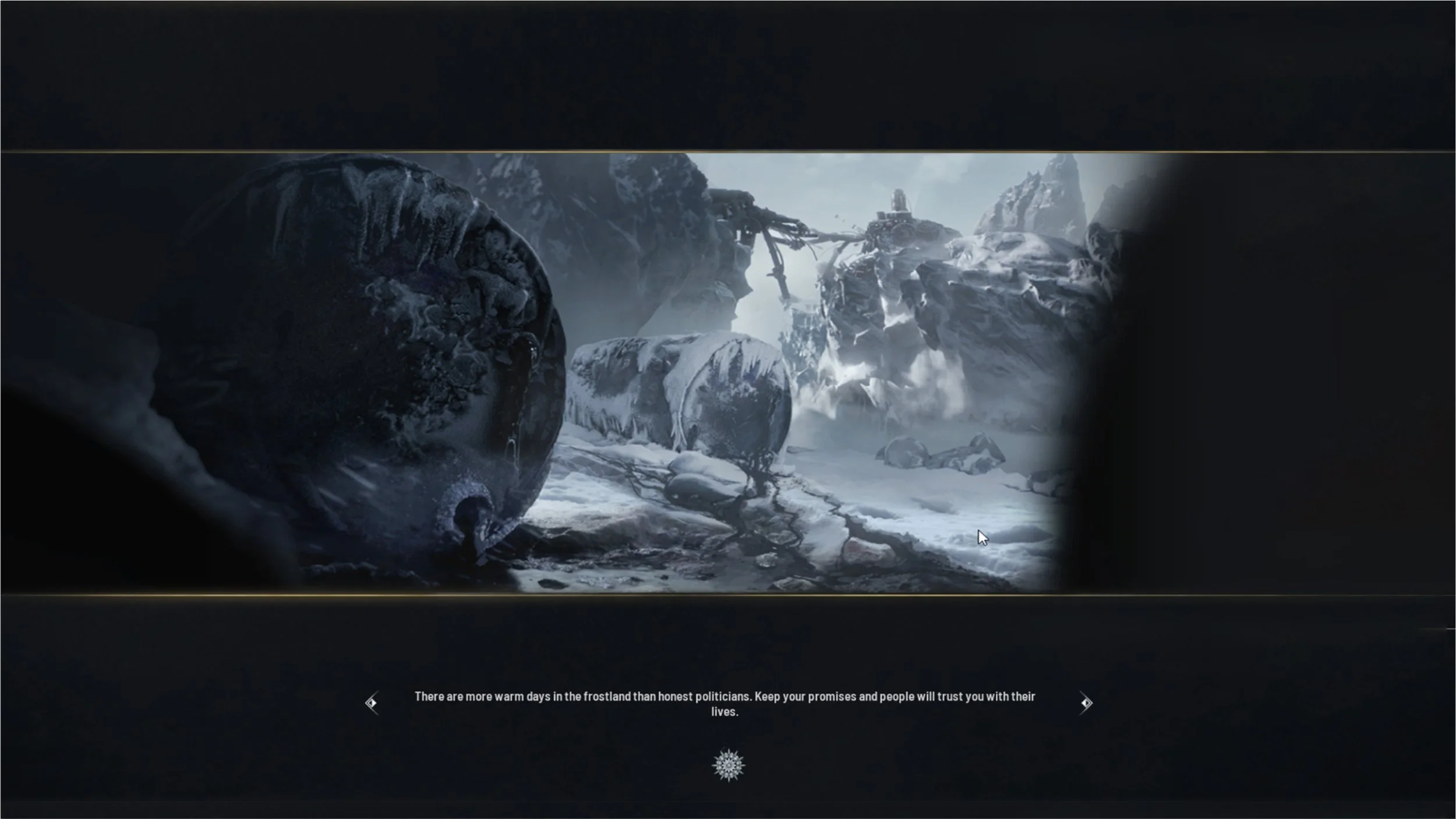
Loading Screen - redesign proposal
Outcome
The updated flow improves clarity and usability by allowing players to confidently compare saves in one place before committing to a selection. The separation of concerns between the Load Game screen and the loading screen reduces confusion and creates a more intentional UX hierarchy.
Although this change was not implemented at the time due to production constraints, it remains a valuable UX insight. It demonstrates how small adjustments in information hierarchy can significantly improve decision-making clarity and reduce cognitive load in complex game systems.